The challenge of designing UX and UI in Japan
This was posted originally on Medium in 2017.
Please, before reading this document, take off your shoes, put on your Yukata and prepare some matcha tea ;)
Ticketbis has been growing swiftly in the past years and boldly spreading its limits to markets from afar. From Germany to South Africa, from Argentina to Japan, we’ve set foot in 47 countries.
So our design team is facing a big challenge: how to make our designs work in so many different cultures? Making “one design to rule them all” is really hard when you’re dealing with both the eastern and the western worlds. And this problem gets especially acute when dealing with Japan, one of our key markets.
First things first:
How does the secondary ticket market work in Japan?
Notorious musical and sports events in Japan get quite often sold-out in the primary market. You can buy tickets in convenience stores, online agencies, or at the venue. There are three ways you can purchase tickets: on pre-sale, on general sale or on the resale market.
If you try to purchase in pre-sale, or pre-order, stages, you may buy tickets before the general sales starts. To do so, you’ll need to be part of a fan club, an agency or a promoter’s club, or sign up for the public pre-order. In any case, you’ll enter a lottery, and if you are a winner, you’ll earn a chance to buy it!
In general sale stages you must go to the primary market to buy your ticket. The problem with general sales is that, usually, the best tickets (regarding to seats location) are sold in the pre-order stage, so in this stage mainly the tickets with lower qualities are available. Another problem is that it’s very common to get a sold-out event in a few seconds.
Therefore, many Japanese have to rely on the secondary market to ensure a ticket for their desired shows. As soon as general market closes, tickets start popping on the secondary market. Some fans participate in a considerable number of lotteries to ensure their tickets, which leaves them with a lot of tickets to resale. And there are also ticket holders can’t attend the event for some reason and therefore decide to put their tickets on sale.
Resale and bidding webs have been working for years in Japan. The street market is also massive. Secondary ticket market is well accepted and integrated within their culture.
So we have this e-commerce in Japan…
And we need to make it work. To understand how can we improve our user experience there, we started to wonder: how is Japanese design like? And why is it not performing as well as in other (culturally different) countries, like Argentina or UK?
Japan is well known by its sense of aesthetics, which we usually relate to minimalism, and simplicity. When we (westerners) think about Japanese design usually something clean and haiku style comes to our minds.
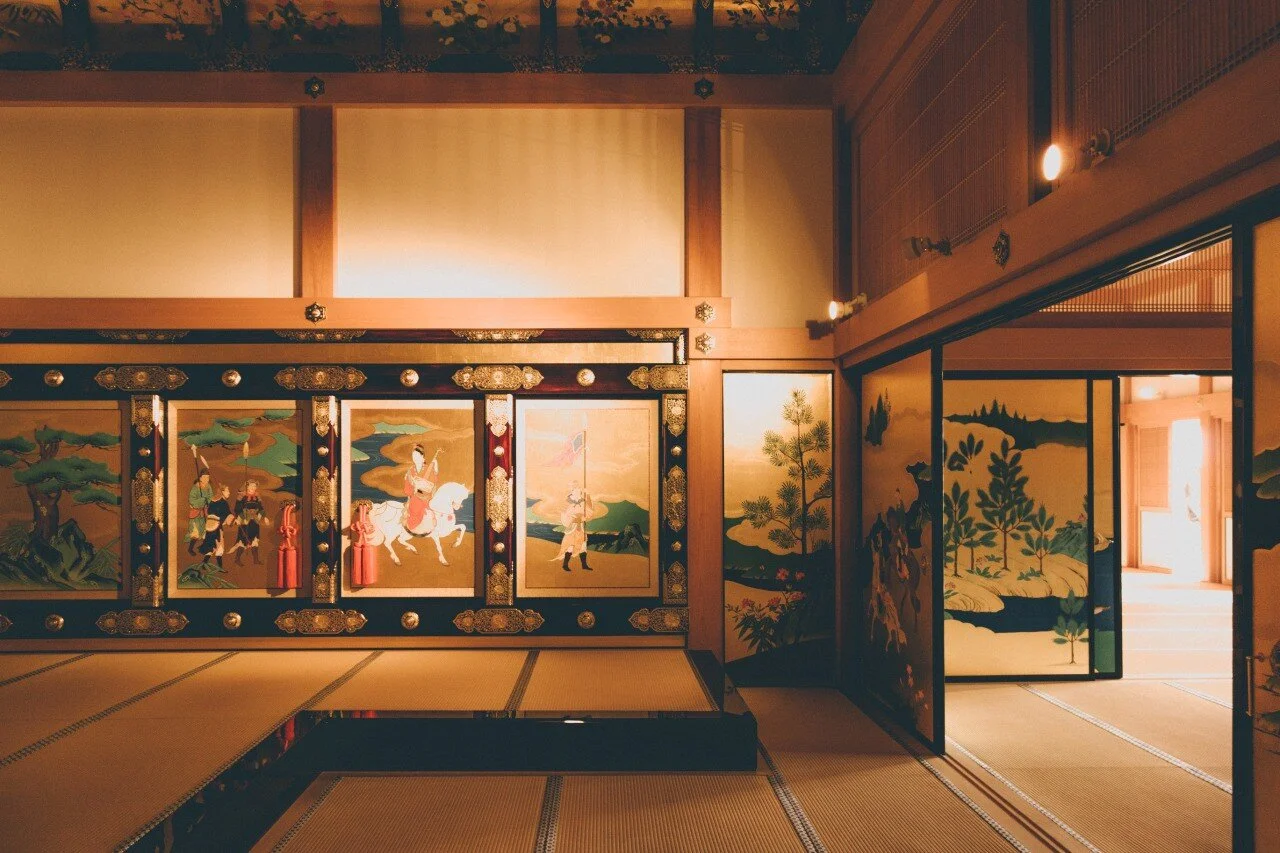
This is because design in Japan often follows the Wabi-Sabi (侘寂) doctrine of aesthetics. Wabi-Sabi is based in the acceptance of imperfection and transcience. It’s a heritage of the Higashiyama period (some 500 years ago) and it is based on the buddhist philosophy, by which transcending imperfection allows a person to perceive real beauty.
You can find Wabi-Sabi applied everywhere in Japan, for example the tea ceremony, the zen gardens, or the Kintsugi, which is the art to repair broken objects (pottery mainly) with gold or silver. So when you break a plate in Japan, instead of throwing away, you glue it back together with gold or silver, which creates a unique scar that turns the piece into art. You can embrace the imperfections of the scar and turn it into beauty.
Wabi-Sabi follows seven principles: Fukinsei (imbalanced), Kanso (simple), Kokou (austere), Shizen (natural), Yugen (subtle profound), Datsuzoku(unworldly), Seijaku (calm).
Another key element in Japanese design is Omotenashi (お持て成し), which is a standard social convention in Japan. It’s the spirit of Japanese hospitality, their etiquette. It’s about how a host should treat their guest and it could be reduced to three (complex) rules: anticipate to your guest’s needs, be formal or informal at their appropriate moments, the guest should never notice the efforts of the host to make them feel welcome, it must be all very natural.
So how does it translate to web design? When you think about using this principles in your customer experiences, the results can be translated as an refined and elegant experience and you can apply them both in offline and online services.
You can find some good examples of how this principle is applied in Mikiya Kobayashi, a furniture design studio, or in Here Now, a web with travel guides.
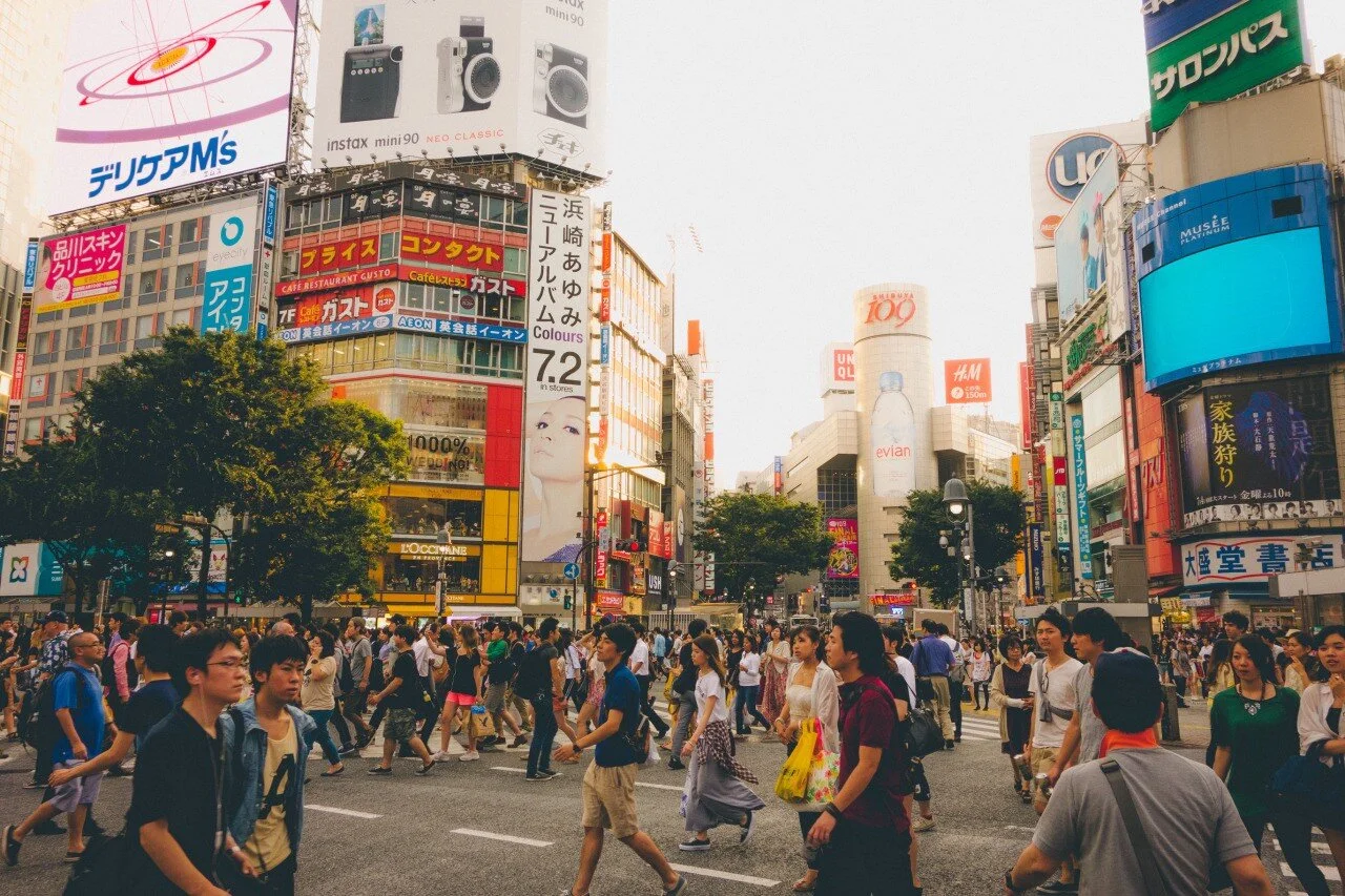
So, how come their web designs are anything but welcoming, unwordly, calm, austere or simple? Browsing almost any Japanese web page, one can quickly realize that none of these principles are followed. Quite the contrary, it seems as if the opposite rules were applied. If you visit the most popular websites in Japan you’ll often find a mix of bright color, excessive use of text and no navigation orientation. There is so much visual noise, that you can feel like you’re walking through the chaos of Shibuya streets in Tokyo.
What rules are the Japanese applying to their websites?
Here are a few that we spotted:
Color usage
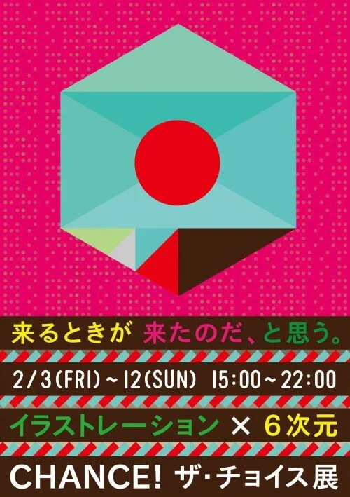
Traditional Japanese design uses a simple three-coloured palette: red, black and gold. But when talking about graphic design, Japan goes way beyond that. The color palette is usually colourful and abusing brightness.
Japanese Exhibition Poster: Chance! The Choice. Furuya Takahiro.
You also need to keep in mind that certain colours have different meanings in different cultures. For instance, in westerner cultures, red is the color of love and excitement and can be associated with both negative and positive purposes. But in Japan it means happiness and joy.
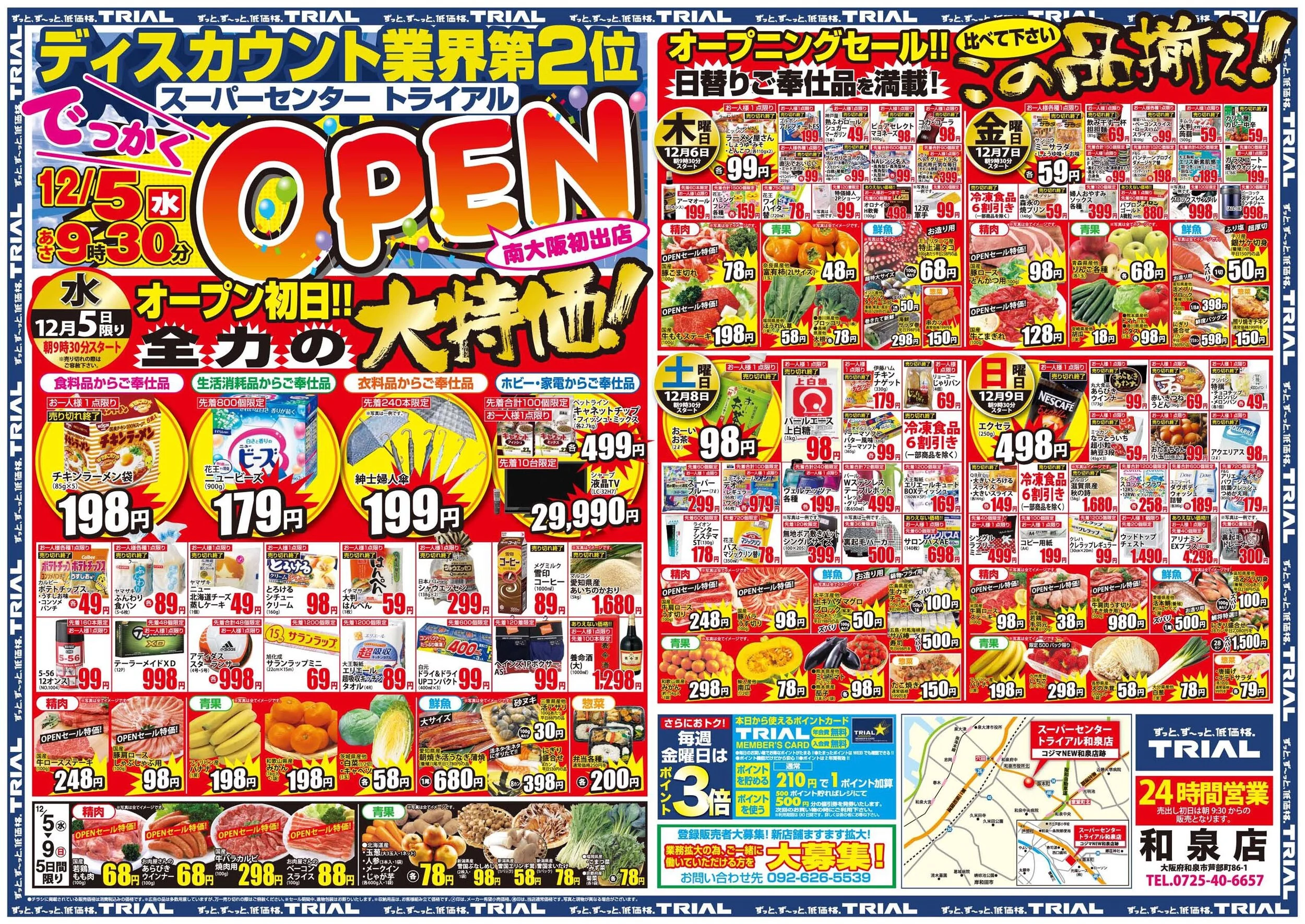
There is a tendency of clean and elegance on graphic design for cultural events or music. But for the everyday life, they still have the crowded, intense design, made to fit everything you need in one place. For westerners this supermarket flyer can be messy and very difficult to read, for Japanese, it’s a way to see every offer, the store location and other ads in just a single page:
Typography
When designing for westerner web sites, one can play with typography to create rhythm and style. But when you have to deal with Japanese writing that’s a different story, since there are only a few available web fonts. Westerner (roman) font families only need to include lowercase and uppercase alphabets, numbers and some symbols and punctuation marks, which is a usually a couple hundred glyphs. But Japanese fonts need to include the katakana and hiragana alphabets and a pile of kanji, which usually means tens of thousands of glyphs, making their web fonts just too heavy to load on a webpage. Using different Japanese font families in a site is simply too hard to worth your while.
Also, Japanese writing doesn’t use spaces between characters and this creates an visual perception of cluttered information.
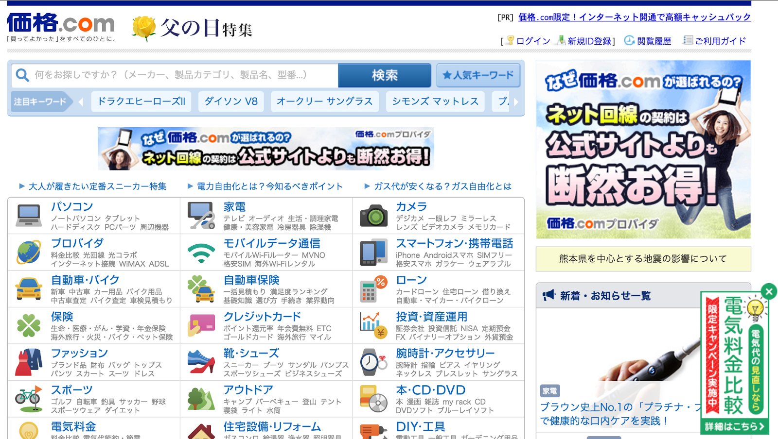
Japanese website kakaku.com
With a quick glimpse at Kakaku we can notice a clear abuse of text in which also many of these texts are created using images (since using several font families is discarded, as we explained before) to be able to use different, highlighted typographies. This practice is used mostly on ad banners, because Japanese characters don’t have uppercase or italics, so designers rely on this jpegs to highlight text.
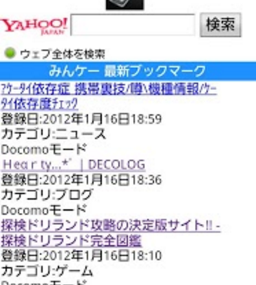
This crowded text design style could be a heritage of early mobile web designs. Japan was an early adopter of mobile web navigation and while the world was displaying websites through their tube screens (when Windows 98 had a good run between blue screens), the Japanese were using their flip phones to access information through MMS, email and 3G in tiny screens, so they needed to fit a lot of information in a small space.
Yahoo! search engine
To make it easy to load and read, this early websites were purely text and contained lots of information in a minimum space. A possible explanation is that Japan has an aged population, and that Japanese culture usually tend to preserve what works. They have a saying: “if it works, don’t fix it” (they still use fax machines, for instance). Therefore, this kind of designs were able to persevere since then and could keep going for at least a few more years.
Competing ads
In Japan, advertising it’s not seen as a tool to facilitate the communication with their targets. Rather, Japanese companies often use the web to push their messages across as hard and loudly as they can. Websites instead of being a interactive tool, end up as a massive concentration of tiny pieces of information fighting each other to attract attention.
Take, for example, Rakuten, one of the most successful e-commerces in Japan:
Japanese version of Rakuten’s category page
Although they have a cleaner design comparing to other websites, there are still too many different styles mixed, the grid for the different types of cards (of products) is too chaotic and seems it has no rules. Also, there is a whole ad carrousel with 8 mini-banners per page in 3 pages between the product blocks.
Kawaii culture
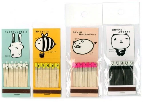
In Japan in the 70’s, girls started to use mechanical pencils which drew thin, consistent lines in opposition to the traditional thick, variable line of ink of the brushes. Girls often drew little things (hearts, stars, faces…) within their texts and the contrast with tradition quickly spread a culture which is now a full standard in Japan. Nowadays everywhere you go there is some adorable animation or cartoon with exaggerated features. From cute stickers in Line to newspaper illustrations, kawaii characters are wherever you look.
Packaging using kawaii images
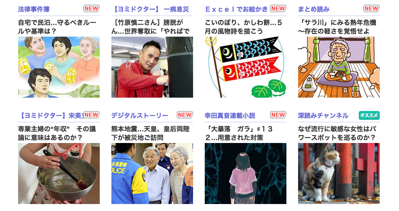
Japanese newspaper Yomiuri uses a mix of photos and kawaii drawings to illustrate news.
Same product, different design
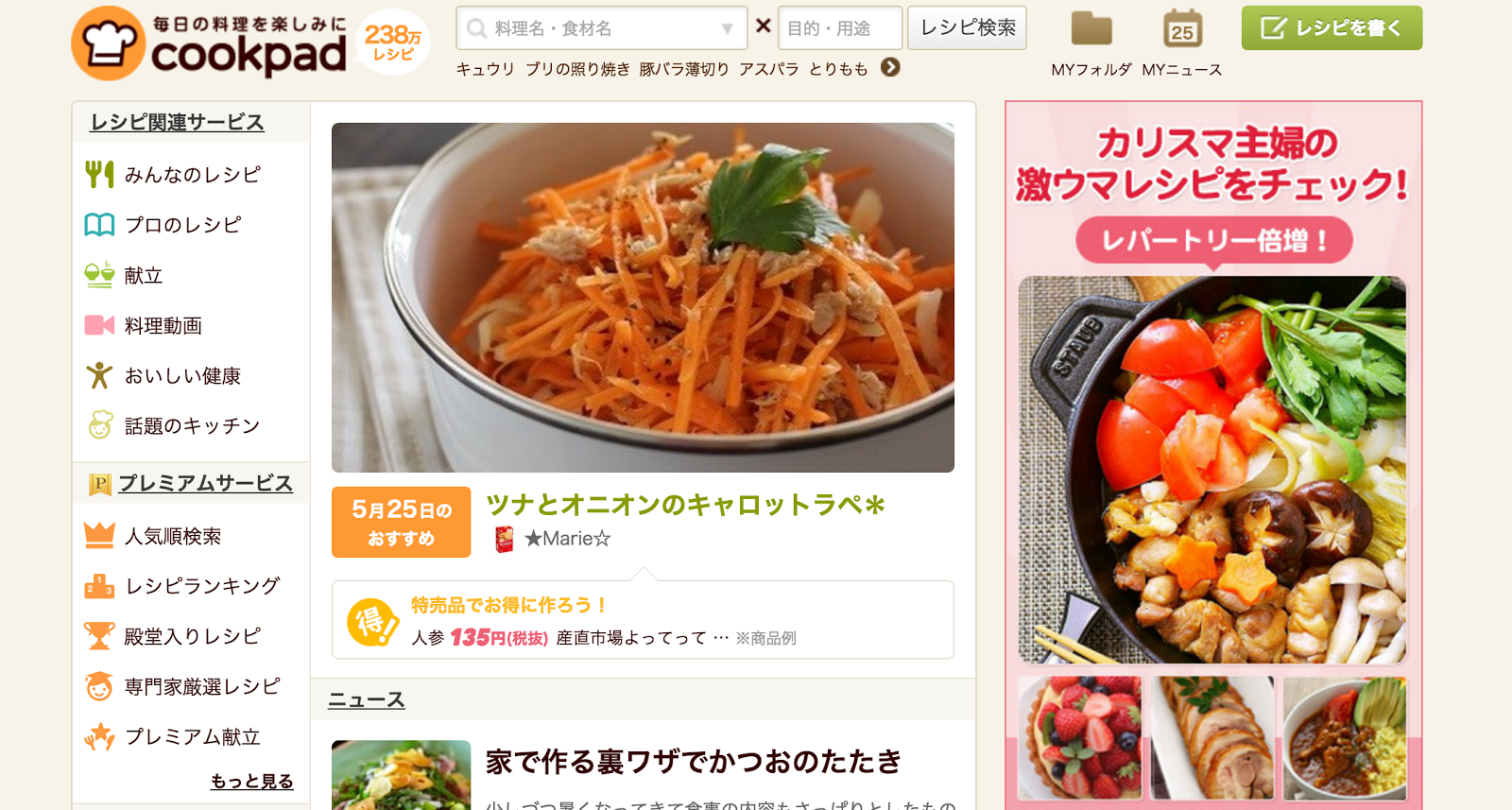
Many websites try to use a consistent design in any country, like Airbnb or Amazon. But there are others that decide to have different UI for the Japanese website. Let’s take a look at one of these sites, cookpad, a web for recipes:
The differences between the westerner version (more specifically, the Spanish version) and the Japanese one are obvious: The Spanish one has a clean Pinterest-like style that uses cards. It’s been designed to expect the users to either search for a very specific recipe or to allow them to browse through the very appealing pictures with delicious food in it.
What about the Japanese version, then? The search field is a lot less highlighted and it has a lengthy vertical navigation menu. The content is headed by a featured recipe (that changes daily) followed by some news and topics (yes, it has a forum, like in the early 2000’s), then some ads and finally some recipes, a few highlighted ones and then a menu to browse recipes by category. It’s as if they tried the opposite approach: Two simple navigation systems vs. many navigation systems; one single task for the user (find recipes) vs. a wide number of choices for the user (forum, recipes, news, videos, etc.); a place to grab a thing and go vs. a portal-like website to stay for ages.
Assumptions
We think it’s safe to assume that the purchase experience in Japan differs from the westerner in a lot of ways. For them the real experience is centred on the object, while in the western side of the world the purchasing experience is a key moment. So, for example, the journey of a customer in Spain could be something like this:
Claudia needs a new perfume and goes to a store where she thinks she’ll find the brand she likes. When she enters the store, she smells the mix of a lot of different perfumes, which finds a bit unpleasant. There are many different brands she can choose, lots of colors, scents and vendors trying to catch her attention. She feels like she is at a duty free store. She looks at a lot of offers from lipsticks, eye shadows, nail polish, etc, and it takes time to find the brand she likes. When she finally does, a very polite vendor greets her.
For a Spanish girl this part of the journey is very important, a lot of things can make her turn back and go home. We assume that in Japan, the experience would begin in the point of sale, when Claudia finds the polite vendor, while in Spain it starts when she decides to purchase the perfume. So, here’s our first question: Is our hypothesis correct? Does the purchase experience starts at the point of sale for the Japanese?
On the other hand, the introduction is really important in Japan. For instance, Japanese follow a business card-exchanging etiquette. When you are given a card, you can’t just put it into your pocket like a tissue. You take your time, read the card, compliment it, and in the end of the meeting, you put it in your card holder. This fact and the Omotenashi principles leads us to believe that, in order to provide a good first approach to our web, we need to present ourselves and give relevant information about who we are and what we do to our visitors. So, considering the welcoming principles and the tolerance of the Japanese to process a lot of information in small spaces, how can we provide valuable information in our sites?
Kawaii is everywhere in Japan. Tokyo’s subway uses it to provide key information, on coffee houses to display prices, road blocks uses funny little animal drawings (like bunnies, dogs or even Hello Kitty®) in their easels, you can find kawaiidrawings even in temples. How can we introduce kawaii into our website without looking forced?
Good practices?
As we go through this stage of research, we’re starting to get inclined to believe that, probably, we need to adapt our site to the Japanese market. However, we also think that, within those rules, there’s plenty of room for improvement. Yes, we’ll need to clutter more information, but we can do it in a cleaner, easier way.
Here are some examples of what we consider good practices:
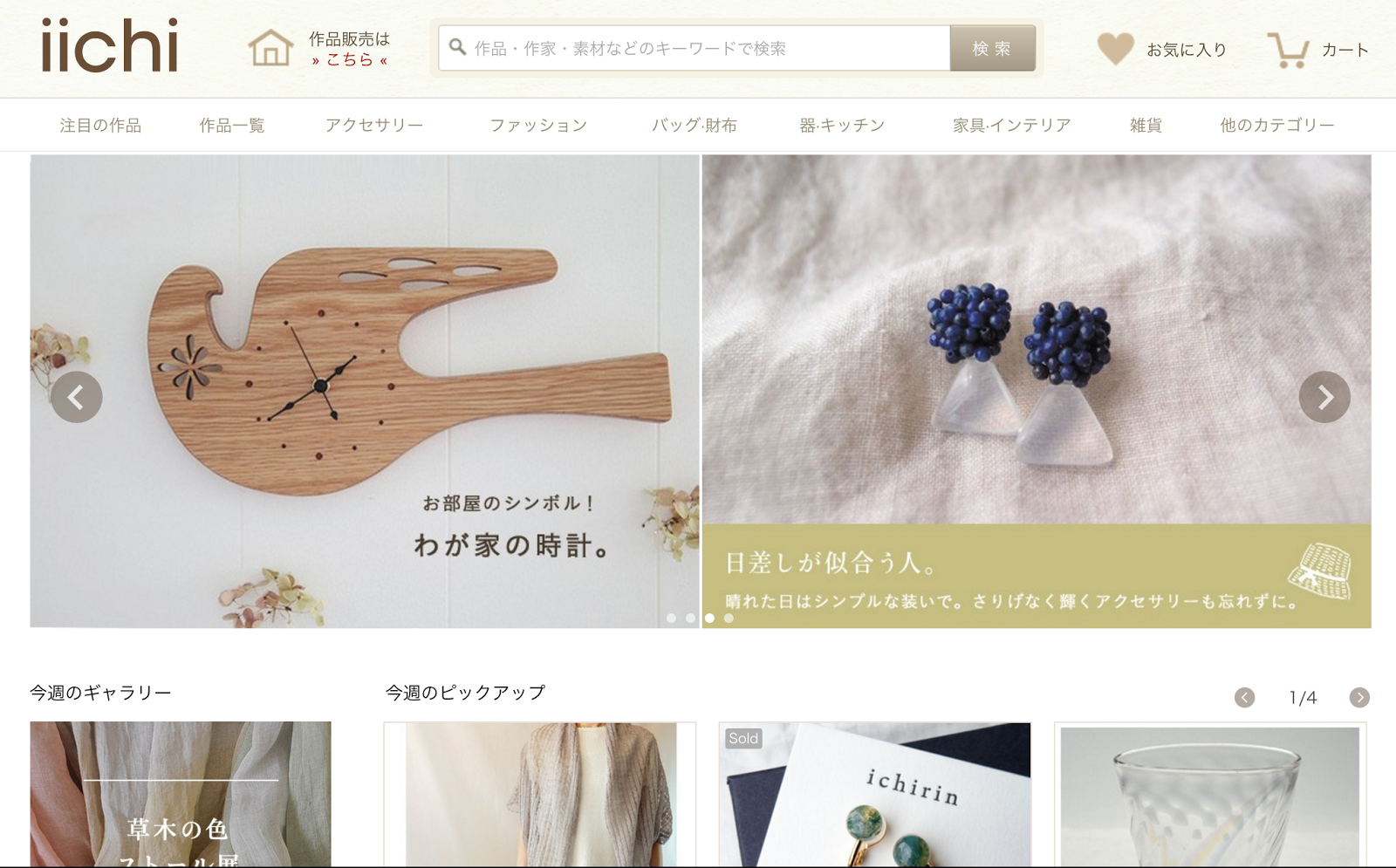
Iichi homepage
Iichi category page
Iichi is an e-commerce that sells home-made crafts and goods, sort of the Japanese version of Etsy. Its UI is very simple and neat, the color palette is very natural, it evokes a sense of calm and tranquility. The choice of typography is also natural and elegant, with thin lines with aesthetic purpose. It has a well defined grid where the product rest in an orderly manner. And it’s intended for a Japanese audience, but it would work perfectly well in any westerner market. Except for the language…
Another good example of simplicity and elegance is Muji’s website. Again, the grid is clear and simple, but the layout is intended for the Japanese market.
Muji’s home page
Of course there are still too many questions to answer, but we hope we are in the right path to understand our users world wide and figure out their needs.
Thanks for reading!

